Product: Namadeno
Platform: Mobile (iOS / Android)
Designer: Arezo Arabi
Role: Product Designer (Full Ownership)
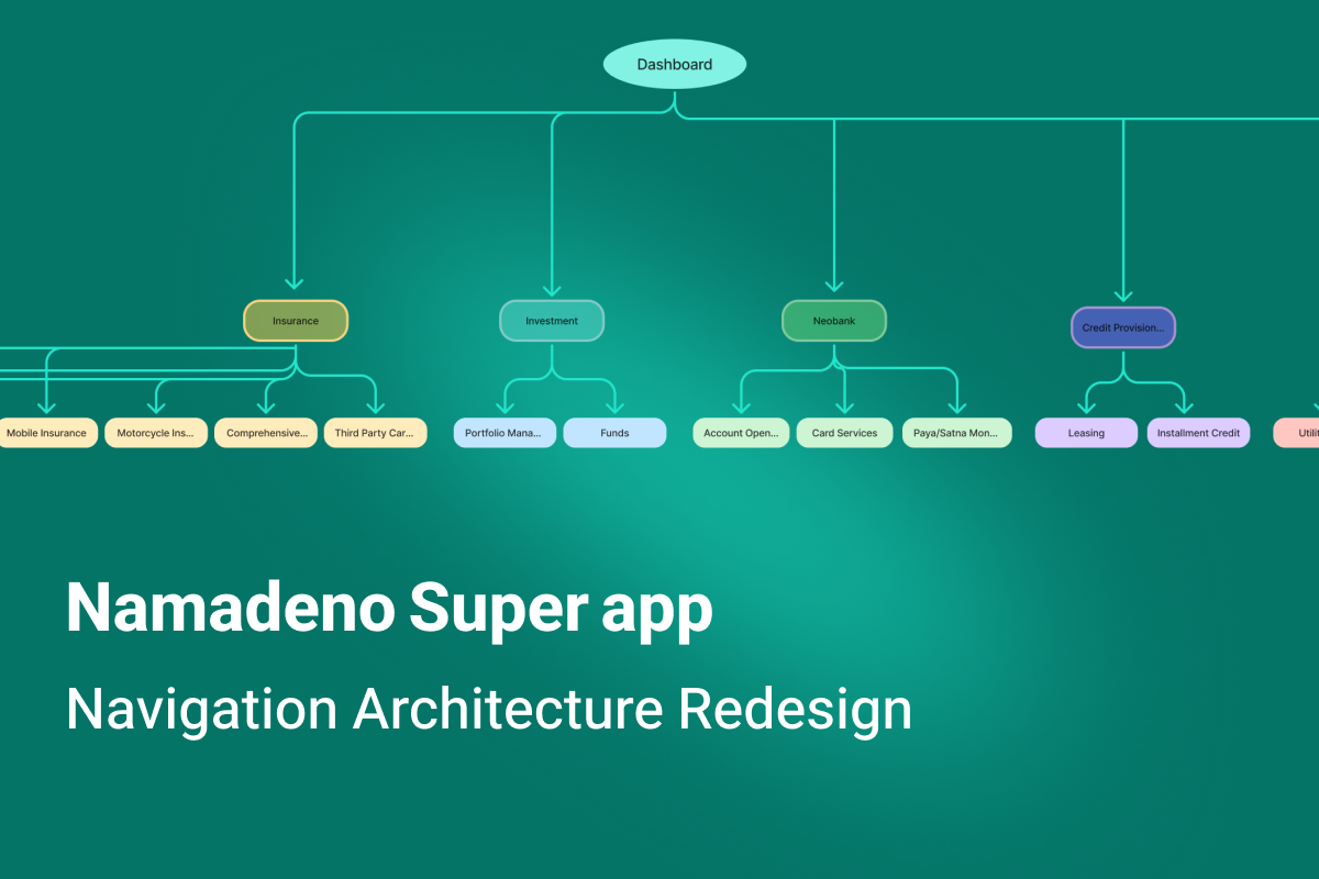
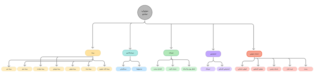
Namadeno is a financial super app designed to integrate multiple financial and quasi-financial services into a single, integrated experience. The product is currently being launched in a limited and internal capacity at the holding level and includes the following main modules:
Financial content and education
From the very beginning of the design, one of the main challenges of Namadeno was that services with completely different natures, risks and levels of commitment had to be brought together in a single app.
Since the beginning of Namadeno, as the sole Product Designer of the project, I have been responsible for the end-to-end design of the product; from:
To reviewing the experience based on real feedback from the team and practical use of the product
Beside me:
and design decisions were made in direct interaction with this team as well as multiple stakeholders.
In the early design stages, the main focus was on:
But as the product grew and deeper, more sensitive flows were added, such as insurance purchases, leasing, and multi-step payments, it gradually became clear that some of the initial navigation decisions, at a larger scale, created new challenges.
These challenges manifested themselves not in the initial design, but:
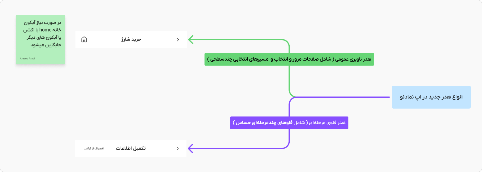
In Namadeno, not all flows have the same behavior and needs. Some paths are short, low-risk, and interruptible, but others:
Examples of these flows:
As the number of these flows increased, the main problem gradually became clear:
How can we manage the user’s movement in deep flows without getting them lost, out of the process, or breaking their focus?
This case study explores the answer to this question.
The navigation challenge in Namadeno was not limited to moving between pages. Examining the scenarios showed that this issue has three layers of impact:
In financial and commitment flows, any navigation friction can cause hesitation, stoppage, or unwanted departure from the path. On the other hand, for the technical team, the unclear return and exit structure also created complexity in implementing and testing scenarios.
For this reason, this issue could not be solved at the “fix a button” level and required a redefinition of the navigation pattern.
Upon reviewing the product flows, it became clear that the problem stemmed from a structural inconsistency:
The variety of flows was high, but the navigation behavior was defined uniformly.
In practice, there were three different types of paths in the product:
However, the navigation system assumed the same Back behavior for all three types of paths. This increased the cost of returning in deep flows.

At this point, a design conflict arose:
On the one hand, the user should be able to quickly exit the flow or change direction. On the other hand, there should be no accidental exits or distractions in sensitive flows.
This conflict arose between three goals:
So the navigation decision had to be context-based, not fixed.
The design problem was formulated as follows:
How can we design a navigation model in a financial superapp with heterogeneous flows that enables fast and low-cost exit, maintains focus and safety of sensitive flows, and keeps the exit rate low at critical stages?
This question became the basis for the next design phase and the examination of different navigation options.
After formulating the navigation problem, I decided to examine and compare different navigation options at the Navigation Pattern level, rather than modifying UI components on a case-by-case basis. The goal was to arrive at a decision-making model that could be applied to a variety of flows, not just a specific path. At this stage, my focus was on the behavior of Back, Home, and Exit in different flows.
Option One: Linear Back-Based Navigation
In this model, the back button in the header always takes the user back one step in the page stack. This pattern is simple, predictable, and aligned with the default OS pattern.
Advantages:
Limitations:
Consequences: Good for short paths, but not financially viable for multi-step flows
Option Two: Add Home in the internal header
In this pattern, in addition to Back, a Home icon is placed in the header of internal pages so that the user can return to the dashboard with one action.
Advantages:
Risks:
Consequence: Good for selection and navigation pages, but risky for sensitive data entry flows.
Option Three: Exit/Cancel Text with Confirmation
In this model, instead of a Home icon, a text action such as “Cancel” or “Exit” is placed in the header of multi-step flows and is accompanied by two-step verification.
Advantages:
Limitations:
Consequence: Creates a safer behavior for long, sensitive flows.
Option Four: Keep Bottom Navigation Deep in Pages
One option explored was to keep the Bottom Navigation on internal pages to provide quick jumping between modules.
Advantages:
Risks:
Consequence: Only acceptable up to select levels, not in staged flows.
Exploring the options revealed that no single pattern fits all flows. The different nature of paths requires that navigation also behave adaptively.
For this reason, the design decision shifted from a fixed model to a Context-Based Navigation model, which determines the behavior of the header and exit actions based on the type of flow.
The different nature of flows, from landing pages to multi-step financial processes, requires different navigation behavior.
For this reason, instead of choosing a single pattern, I defined an adaptive navigation model that adjusts the behavior of the header and exit and return tools based on the type of flow.
In this model, the path type determines what navigation tools the user sees, not just the depth level of the page.
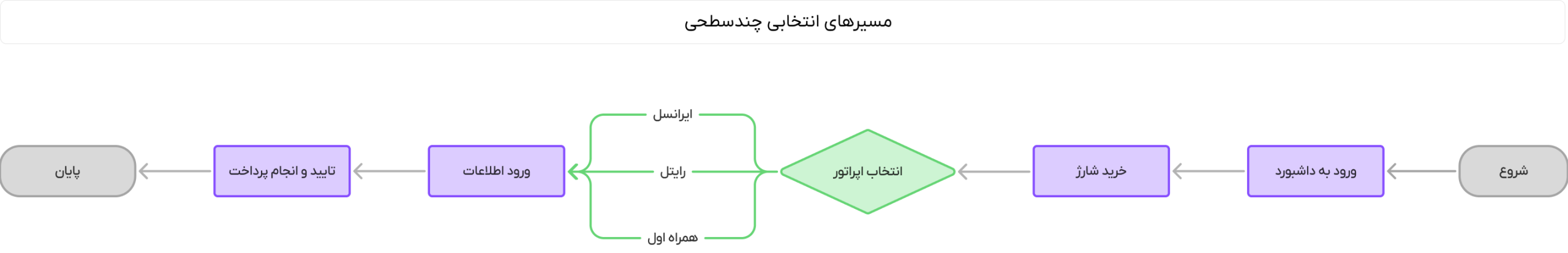
To operationalize the model, I first divided the product flows into three behavioral categories:
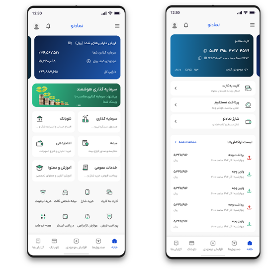
Explore and Select Pages
List pages, categories, service selection, information viewing
Linear Back Active
Bottom Navigation Only to First Depth
Home Icon in Header
Jumping Between Modules Allowed
Goal: High movement speed
Multi-level selective paths
Choose a fund, choose a service type, choose a product
Linear Back Active
Home Icon in Header
Quick Return to Dashboard
Goal: Reduce return costs without creating risk
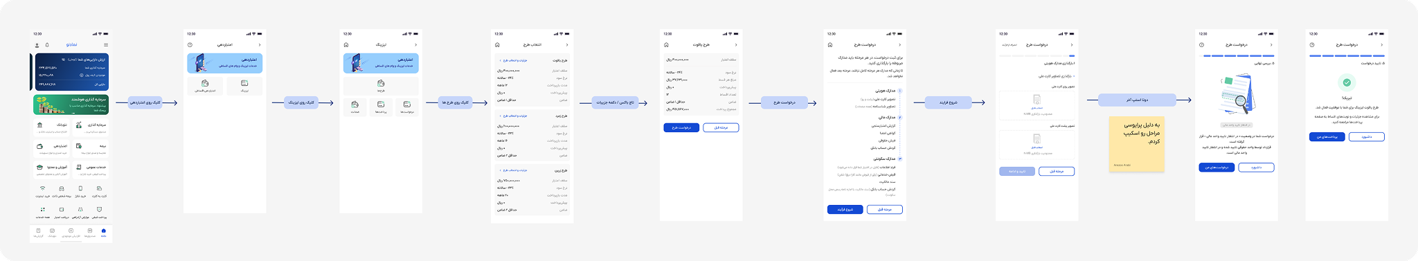
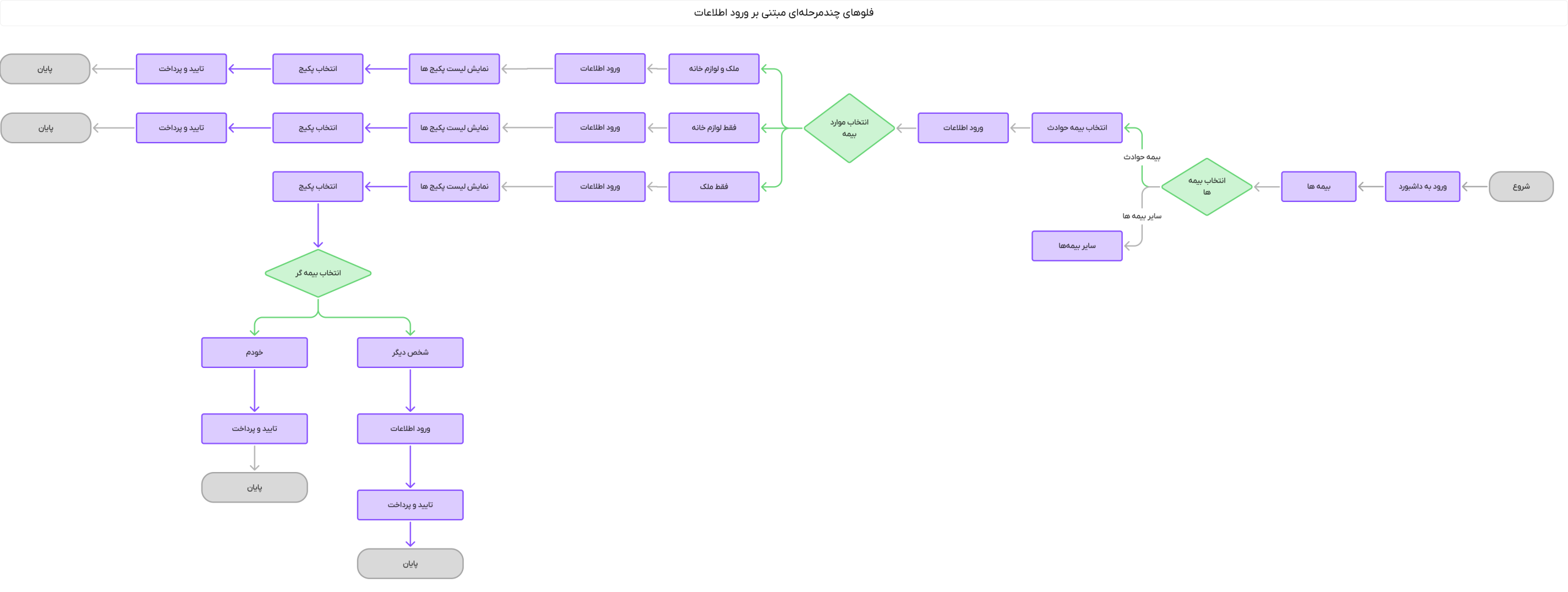
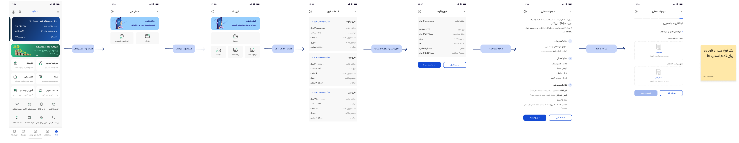
Sensitive multistage flows
Insurance purchase, leasing application, payment, OTP, final confirmation
Back step in flow
Home icon removed
Replaced by “Cancel/Exit Process” action
Exit is accompanied by a confirmation dialog
Goal: Maintain focus + prevent accidental exits
Based on this model, headers were limited to two main patterns:
General navigation header
Staged flow header
Reducing the diversity of headers to two patterns reduced the complexity of implementation and learning.
To prevent navigation interference, a depth rule was defined:
Bottom Navigation is only displayed up to the selected layers and is removed when the flow starts in stages.
This rule:
An important aspect of this process was the final model approval with the Product Manager (PM). Since the navigation model had a huge impact on user interaction and team coordination, it needed to be aligned with the product needs and strategic goals.
At this stage, we held meetings with the Product Manager to review the impact of the changes, and after final approval, the adaptive navigation model was introduced to the technical team.
After defining the adaptive navigation model, the next step was to translate the UX decisions into actionable rules for the front-end team. After a meeting to present the problem and its solution and to hear and get approval from the front-end team, the goal was to make the navigation behavior not dependent on the developer’s personal interpretation and to implement it in a rule-based manner.
To this end, the navigation behavior was documented as a set of specific rules for the flow type, header type, and Bottom Navigation state. This documentation elevated the navigation decision from the component level to the system level.
Once the navigation rules were defined, the test scenarios also became clearer. The technical team could know:
On each type of page:
This clarity reduced the cost of testing deep scenarios and made it easier to reproduce navigation errors.
At this point, the navigation model was transformed from a design decision to an implementation contract between design and development. This transformation reduced the risk of different interpretations and inconsistent implementations, and made navigation part of the product design system, not just a UI decision.
Design outcome and effects on user experience
Impact on technical team and product performance
Lessons learned
Final Concolusion
The adaptive navigation model significantly improved the user experience, increased focus on critical flows, and reduced technical team issues. It was designed as a comprehensive solution for multiple paths, and had a positive impact on the overall performance of the product.